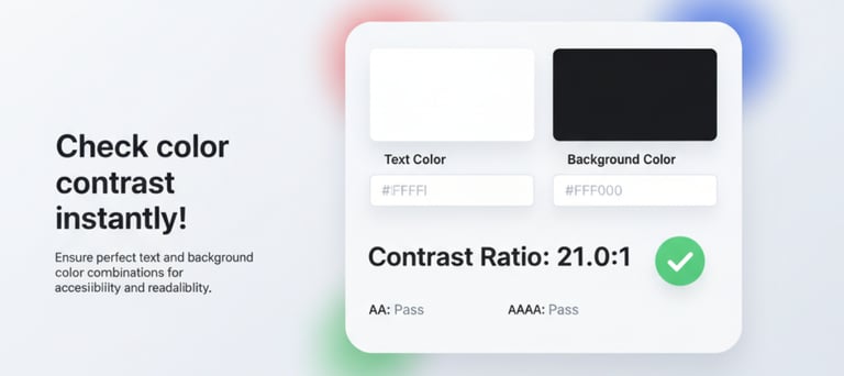
Instantly check the color contrast ratio between two colors to ensure your designs meet accessibility standards. Our color contrast checker helps you easily create visually appealing and readable text, backgrounds, and UI elements.
Color Contrast Checker
Color Contrast Checker online for free | Test WCAG Color Contrast Ratios for Accessible Design
Check WCAG Color Contrast Ratios
Enter your foreground and background colors in HEX or RGB, or choose a color using the color picker. Adjust the lightness level to fine-tune your contrast and instantly check accessibility compliance.
How to Use the Color Contrast Checker Tool
Understanding Color Contrast Ratio
To make your website more inclusive and accessible, it's important to meet the Web Content Accessibility Guidelines (WCAG) 2.1 standards. These ratios help ensure text is easy to read for people with visual impairments.
WCAG 2.1 Level AA:
Normal Text → Minimum Contrast Ratio 4.5 : 1
·Large Text → Minimum Contrast Ratio 3 : 1
WCAG 2.1 Level AAA:
Normal Text → Minimum Contrast Ratio 7 : 1
Large Text → Minimum Contrast Ratio 4.5 : 1
Tips: Large Text is typically 18 pt (24 px) or larger, or 14 pt (18.66 px) bold.
More Tools
© 2026 ARROWPIX. All rights reserved.